Venturing Off To The Dark Side Of The Moon With Pink Floyd
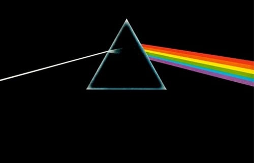
Here is another of our weekly instalments where we will explore art and design. Currently we are looking at some of the best album cover art that has been created over the past several decades. This week our focus is on Pink Floyd’s 1973 release ‘Dark Side of the Moon.”
Chances are that if you have never heard of Pink Floyd, you would still recognise the front cover of this particular album. In fact, the band is not only well-known for their music, but many of the album covers that were produced for them have become iconic.
The original release of ‘Dark Side of the Moon’ was in a gatefold format. The sleeve was designed by George Hardie and the design firm Hipnosis. In fact, the designers had worked with the band on previous album covers that the record company found both confusing and controversial.
What Pink Floyd had been doing was releasing album covers that did not identify the band or the name of the record. The record company found this to be an issue as traditionally these details were the focal point of any good album cover. Pink Floyd felt that the cover art was more important and set out to forge a new path with this concept.
Considering the success of the Pink Floyd catalogue to this point, the matter of covers without titles was never really addressed. However, with this release, the band did include the lyrics written by the band’s Roger Waters on the album’s sleeve – a first for Pink Floyd.
For the ‘Dark Side of the Moon’ cover, Richard Wright of the band instructed designers Storm Thorgerson and Aubrey Powell to create something that was quite simply, “smarter, neater – more classy.” As lofty an idea as that may have sounded, Thorgerson happened upon a photograph of a prism with a colour beam shooting through it in a photo industry book.
Hardie actually created the artwork for the album and produced seven different designs based on the prism/light concept for approval. The four members of the band all agreed on the one that ended up being used.
The design actually represents three elements related to the band – Pink Floyd’s stage lighting, the lyrics on the album and the request for something with a simple and bold design. Waters was who came up with the idea of extending the spectrum of light from the prism through to the album gatefold. The gatefold contains a visual representation of a heartbeat – the sound that is used throughout this particular album.
Thorgerson contributed to the back cover with his suggestion of another prism recombining the spectrum of light. The most interesting part of the design comes from the light spectrum itself. It displays just six of the seven colours that the light spectrum is traditional split into and missing indigo.
Pure Music Manufacturing is a CD manufacturing company based in Manchester UK. They offer a wide range of CD/DVD manufacturing services from pressing to packaging and aim to be an affordable, one-stop CD replication service. In addition, Pure Music Manufacturing also provides various packaging options to suit your needs and budget.


