Rubber Soul Album Cover
“Rubber Soul” Reveals The Punny Side of The Fab Four
This is another installment of Behind The Cover. This is a regular feature where we examine the story behind the music and the cover artwork of a classic release from the past few decades. It is brought to you by Pure Music Manufacturing
The sixth studio album released by the English rock band The Beatles came out in 1965. It was a critical success topping the music charts in the United States, United Kingdom, Australia, Sweden, and West Germany. It has been certified 6x platinum by the RIAA in the US, platinum in the UK, New Zealand, Canada, Australia, and Argentina. It has been certified gold in Brazil and Germany. It produced many hit singles including “Michelle,” “Norwegian Wood (The Bird Has Flown),” and “Nowhere Man.” Depending on what market you lived in, the tracklisting differed slightly. The album proved to be influential on the band’s peers which saw the music industry shift slightly away from producing singles to creating high-quality songs.
Giving the album the title of Rubber Soul was intended as a pun where The Beatles were trying to combine the falseness that was connected to pop music at the time and rubber-soled shoes. Paul McCartney came up with the title after hearing an American musician describe the singing style of Mick Jagger as being “plastic soul.” Ringo Starr later stated in a radio interview that the title was, in a way, an acknowledgment that when compared to American soul artists, any British act trying to do the same just didn’t have the right ingredients. Starr actually stated the main difference was, “we are white” which pretty much summed it up.
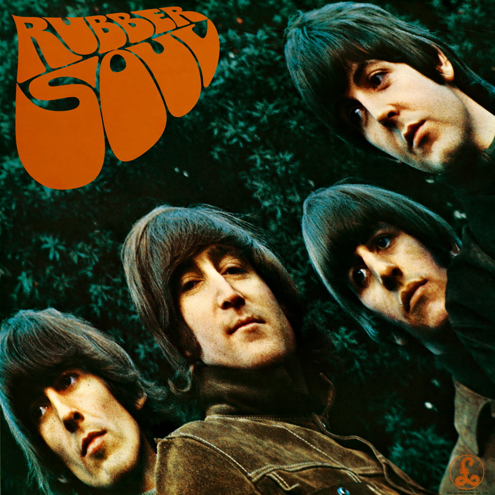
This was also the first album released by The Beatles that did not include the band name on the front cover. Whether or not that was intentional will probably never be known. However, the omission did reflect how much control the band had over their releases and the power of their international fame. The photo was taken by photographer Robert Freeman and it was set in the garden at John Lennon’s house. The stretched image was a mistake that occurred when Freeman had projected the photo onto a piece of cardboard that was cut to the size of an LP and slipped slightly when it was being viewed by the band. The band reacted favorably to the elongated photo and wanted that on the cover.
The lettering was designed by illustrator Charles Front that he had created himself with inspiration from the album title and a rubber tree. Little did he know at the time that the lettering he was creating would end up used as a style that became ubiquitous with what we all now refer to as psychedelic designs from the flower power generation.
Based in Manchester, UK, Pure Music Manufacturing is a CD manufacturing company. They can take care of all your CD/DVD replication requirements. This includes pressing and packaging and Pure Music has many packages available to fit both your budget and project needs. They aim to be your one-stop source for all of these services.

